Designing the Tidbit Mobile Health System
In today’s health care environment, increasing costs and inadequate medical resources have created a worldwide need for more affordable diagnostic tools that are also portable, fast, and easy to use. We used iterative design methods to create a low-cost mobile health system.

Numerous research and commercial efforts have focused on developing rapid diagnostic technologies, but the efficacy of existing systems has been hindered by usability problems or high production costs, making them infeasible for deployment in at-home, point-of-care (POC), or resource-limited settings.

Methodology
We used an iterative design methodology to engineer three versions of a portable diagnostic testing device that were evaluated for usability and overall user receptivity.
The research consists of three stages and accompanying system variants:
(1) Design critique and in-lab study with 26 participants of our original prototype NutriPhone
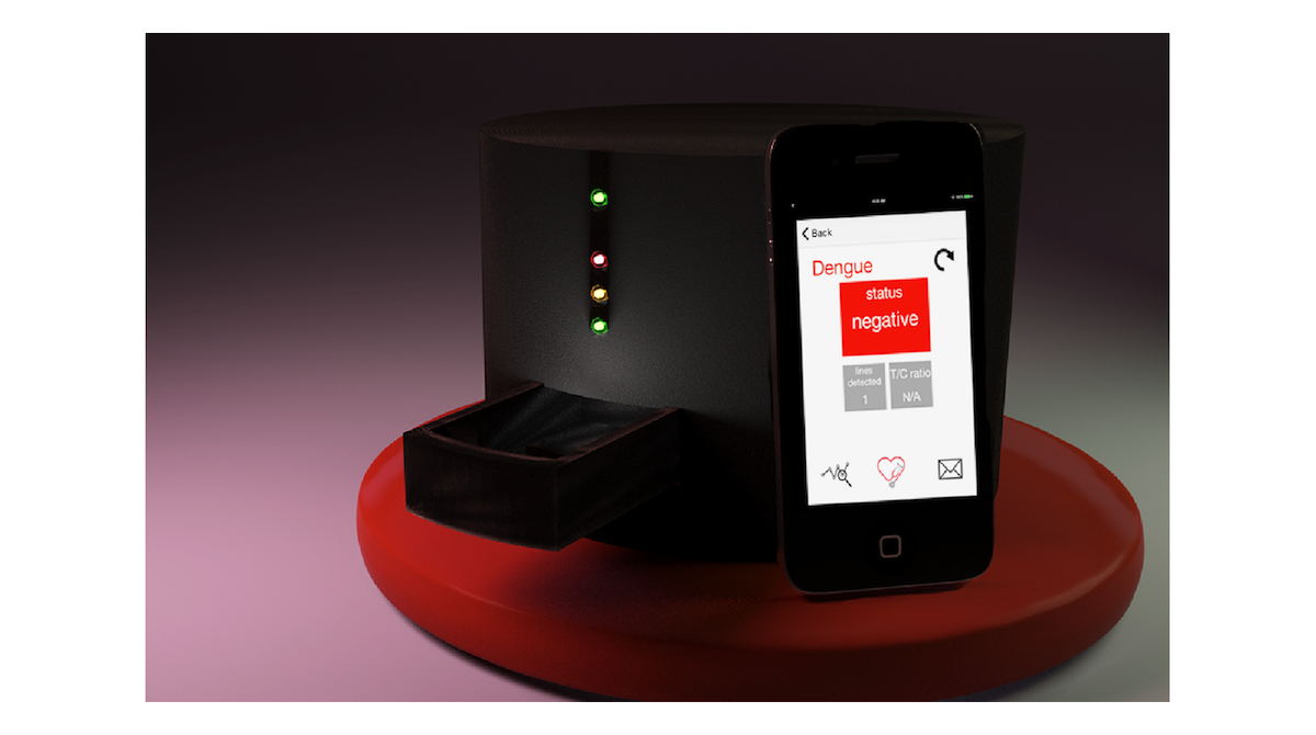
(2) Ideation, prototyping, and in-lab evaluations with 6 participants of the second version of our system that adopted a stand-alone reader
(3) Development and in-lab evaluations with 6 participants of our refined reader system Tidbit

Participants also told us about any follow-up actions they would take based on the result and how they envisioned, generally, using our proposed personal health system.
Main Findings
We identified a number of system requirements and considerations (e.g., software compatibility, biomatter contamination, and physical footprint) that we worked to incrementally incorporate into successive system variants.
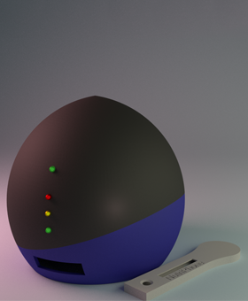
Our final design phase culminated in the development of Tidbit, a reader that is compatible with any Wi-Fi-enabled device and test strip format.
The Tidbit includes various features that support intuitive operation, including:
• A straightforward test strip insertion point
• External indicator lights
• Concealed electronic components
• Asymmetric shape, which inherently signals correct device orientation
Usability testing of the Tidbit indicates high usability for potential user communities.

Recommendations
The methodology of this study demonstrates the importance of testing these types of systems with potential users and exemplifies how iterative design processes can be employed by multidisciplinary research teams to produce compelling technological solutions.
Design features for mHealth technologies should adhere to the principles of universal design and accessibility.
• It is essential to balance the needs of diverse users and create a design that is easily accessible for potential user communities
• Large, black font on a white background was viewed as a vital element for accessibility among a diverse population
• Large navigation buttons and straightforward, simple language seemed to aid users in progressing through the app instructions
• Visual aids, including diagrams, photos, and video, are helpful in guiding users through the procedure
• Make designs platform-agnostic to take advantage of users' familiarity with their own devices
Simple operation and an appealing design could help in system adoption and adherence.
